Shibuya vs. Tulsa: Why the Same Cookie Label Lands Two Very Different Ways
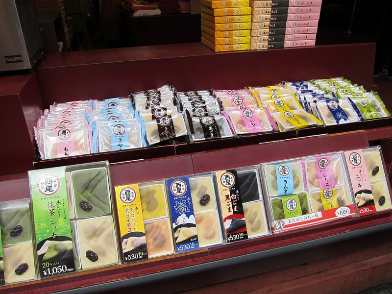
Photo: hslo, CC BY-SA 2.0, via Wikimedia Commons
Last spring, a friend sent me a photo from a drugstore shelf in Tokyo: a tidy row of pastel snack boxes, one of them stamped with a bust size, cheerful as a cereal box. She'd been living in Japan for two years. “This is completely normal here,” she wrote. “I sent the same photo to my sister in Oklahoma and she asked if it was a joke.”
That split reaction is basically the whole story. Same cookie. Same six letters. Two completely different rooms.
Same Shelf, Different Room
In Japan, the phrase “F-cup” on a beauty snack works as shorthand. It's a little playful, a little aspirational, and — this is the part that rarely survives the flight — deliberately indirect. Japanese beauty marketing has a long history of talking around the body instead of pointing at it: language about “beauty from within,” about daily habits, about becoming a slightly more polished version of yourself. The size on the box is a wink, not a specification sheet.
In the US, we read labels like contracts. If a package puts a number on the front, most American shoppers assume it's making a claim, and claims invite scrutiny. So the same box reads as: we think your body should look different. That's a much heavier sentence than “cute snack, nice routine.”
Why “Cute” Doesn't Always Travel
Tone is the first thing to get lost when a product crosses an ocean. A pastel palette, a mascot, a chirpy font — those are tone markers. They signal this is fun, don't take it too seriously. But import the product without the surrounding shelf, the magazine ads, the vending machine culture, and the tone doesn't come with it. What reads as a wink in Shibuya can read as a billboard in Tulsa.
That's not a failure of either culture. It's just what happens when a phrase leaves home without its context.
The Confidence Sell vs. the Claim
There's a real difference between two sentences:
- “This is a treat that fits into your routine.”
- “This will change your body.”
The first is lifestyle marketing. The second is a promise, and in the US, promises come with paperwork. Regulators here expect advertisers to be able to back up objective claims with competent and reliable evidence, which is why you'll notice that careful American supplement copy leans hard on words like supports and helps maintain — and why the boldest packaging claims tend to live in the gray zone of “feels.”
We think that's actually fine. “Feels” is honest territory.
What We'd Rather Say Out Loud
Here's our position, plainly: a cookie is a lovely vehicle for a daily ritual. It's a bad vehicle for a body guarantee. So when we talk to American shoppers, we try to stay on the side of the line where the language is about how you feel — confident, taken care of, a little bit indulged at 3 p.m. — and not about measurements, which no snack can responsibly promise.
Three things good packaging can do here:
- Say what the product is. A cookie with added ingredients, sold as a snack. Not a treatment, not a replacement for a balanced diet.
- Say what it isn't. No guarantees about your cup size. No timelines. No before-and-after.
- Skip the ruler. Confidence is the product benefit worth naming. Millimeters aren't.
The Name Stays. The Conversation Changes.
We named our cookies F-Cup because that's the language the product was born into, and we think pretending otherwise would be a little dishonest. But a name is a starting point, not the whole pitch. In the US, we'd rather you hear “self-care you can eat” than “here's what's wrong with you.”
The funnier, truer version of this product isn't about a number on a box. It's about a small, sweet ritual you look forward to — one that happens to fit in a desk drawer and doesn't require a ten-step routine or a lighting setup.
So, Tulsa: we hear you. The label can stay cute. The promises should stay small. And the cookie should still taste like a cookie.